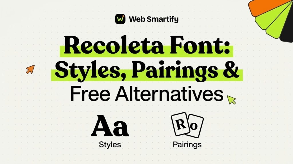
A bakery owner scrolls through logo ideas and keeps stopping on soft, rounded serif letters. Many of those designs share one typeface, and its name appears again and again in design communities. The Recoleta font has become a favorite for brands wanting friendly nostalgia without looking dated.
Designers love Recoleta for packaging, menus, book covers, and social media graphics that need personality and warmth. Readers who browsed the handwritten fonts collection here know how much typefaces affect brand feeling. Recoleta brings a similar human touch, but with the structure and clarity of a classic serif.
This guide covers the history, styles, licensing, pairings, alternatives, and practical uses of Recoleta in clear language. Readers will also find comparison tables, setup steps, common mistakes, and answers to frequent questions. Each section stays practical, so designers and small business owners can use the font with confidence.
Quick Answer: What Is the Recoleta Font?
Recoleta is a retro serif typeface by Jorge Cisterna, published by Latinotype, a type foundry in Chile. It blends soft 1970s shapes with modern details, which suits logos, packaging, and headlines. A Regular demo exists for testing, while commercial projects need a paid license.
Recoleta Font at a Glance
A short summary helps readers understand the typeface before reading the detailed sections that follow below:
| Feature | Details |
|---|---|
| Classification | Retro display serif |
| Designer | Jorge Cisterna |
| Foundry | Latinotype, Chile |
| Release | 2018 |
| Main family | 14 styles |
| Extra families | Recoleta Alt and Recoleta Basic |
| Language support | Latin and Russian Cyrillic |
| Free option | Regular demo for testing and personal use |
The table shows that Recoleta offers a broad family, while the free demo covers only limited personal testing.
What Makes the Recoleta Font Special?
Recoleta combines ideas from several popular 1970s typefaces into one fresh design with modern spacing and details. Latinotype describes it as a mix of soft shapes like Cooper and angled strokes like Windsor.
The result feels warm, friendly, and slightly playful, yet still polished enough for professional brand identities. That balance explains why food brands, cafes, publishers, and lifestyle companies often choose Recoleta for their visuals.
In simple words, Recoleta is a soft retro serif that makes brands feel warm, friendly, and memorable.
Soft Rounded Serifs
Recoleta uses rounded serifs and gentle curves that remove the sharp, formal feeling of traditional book typefaces. Those soft shapes make headlines feel inviting, which helps brands that want customers to feel relaxed and welcome.
High Contrast Strokes
The typeface mixes thick and thin strokes, especially in heavier weights, which adds drama to large headlines. That contrast helps short words stand out on packaging labels, posters, and social media graphics with busy backgrounds.
Stylistic Alternates
Recoleta includes stylistic alternates that change the look of certain letters for logos and special display uses. Designers can swap characters to create unique wordmarks without drawing custom lettering from scratch.
Recoleta Font Styles and Weights
The Recoleta family covers many weights, which gives designers flexibility across headlines, subheadings, and short text. Lighter weights suit body text and captions, while heavier weights create strong and confident headlines.
| Family | Styles | Best use |
|---|---|---|
| Recoleta | 14 styles across many weights | Headlines, logos, and editorial work |
| Recoleta Alt | 7 styles with alternate letters | Unique wordmarks and display text |
| Recoleta Basic | 7 styles with simpler shapes | Cleaner layouts and longer reading |
Most brand projects use one heavy weight for headlines and one lighter weight for supporting text and captions.
Choosing the Right Weight
Thin and light weights look elegant on large posters but can disappear at small sizes on screens. Medium and regular weights balance readability and personality, which suits menus, brochures, and website subheadings.
Bold and black weights deliver the classic Recoleta look that many people recognize from popular brand packaging. Designers should test each weight at real sizes before finalizing any print or digital layout.
Where Is the Recoleta Font Used?
Recoleta appears across many industries, although food, beauty, publishing, and lifestyle brands use it most often. Its friendly personality helps products feel handmade, inviting, and slightly nostalgic without looking cheap or childish.
| Industry | Common use | Why it works |
|---|---|---|
| Food and drink | Packaging and menus | Warm, inviting, and tasty feeling |
| Beauty and wellness | Labels and websites | Soft and gentle personality |
| Publishing | Book covers and magazines | Retro charm with clear headlines |
| Technology startups | Landing page headlines | Friendly contrast with clean interfaces |
| Events and weddings | Invitations and signs | Elegant yet relaxed style |
These examples show how one typeface can serve many industries when designers adjust weight, color, and spacing.
Is the Recoleta Font Free?
Recoleta is a commercial typeface, so most projects need a paid license from Latinotype or an authorized reseller. A Recoleta Regular demo appears on free font sites, but the author notes it serves testing purposes only.
Some design blogs call the demo free for personal use, which still excludes client work and branding. Designers should read the license file inside every download before using any font in published work.
Retail listings show the full Recoleta family at around $129, with frequent discounts on some marketplaces. Individual styles cost less, so small projects can buy only the weights they actually need.
Free demo fonts help with testing, but commercial logos, packaging, and websites always need a proper license.
Recoleta Font Licensing Explained
Font licenses define where a typeface can appear, so reading them protects designers and clients legally. Most foundries offer separate licenses for desktop, web, app, and digital publishing uses.
| License type | Covers | Example use |
|---|---|---|
| Desktop | Installing fonts on computers | Logos, print ads, and packaging |
| Web | Embedding fonts on websites | Website headlines and body text |
| App | Embedding fonts inside mobile apps | App interface text |
| Digital publication | Ebooks and digital magazines | Embedded ebook typography |
Each license type covers a separate use, so a desktop license alone may not cover website embedding.
Best Font Pairings for Recoleta
Recoleta works best as a headline font, so it usually pairs with a clean sans serif. A simple partner lets Recoleta’s personality shine without making the whole layout feel busy or crowded.
| Pairing font | Style | Why it works |
|---|---|---|
| Inter | Neutral sans serif | Clean body text balances retro headlines |
| DM Sans | Geometric sans serif | Friendly shapes match Recoleta’s softness |
| Poppins | Rounded geometric sans | Playful tone suits lifestyle brands |
| Work Sans | Simple grotesque | Clear reading for long website pages |
| Lora | Book serif | Warm editorial feel for magazines |
These pairings keep layouts readable while letting Recoleta carry the brand personality in headlines and logos.
Pairing Tips for Designers
Designers should limit layouts to two typefaces, with Recoleta for headlines and one partner for supporting text. Matching x height and line spacing between fonts helps the pairing feel intentional instead of random.
Color and size contrast also matter, since a bold Recoleta headline needs enough space around it to breathe. Generous margins and simple colors let the typeface create impact without competing elements nearby.
Free Alternatives to the Recoleta Font
Several free fonts share Recoleta’s soft retro feeling, which helps students and small businesses on tight budgets. These alternatives come from Google Fonts, so they carry open licenses for personal and commercial projects.
| Free font | Similarity | Best use |
|---|---|---|
| Fraunces | Soft serif with adjustable softness | Headlines and editorial layouts |
| Young Serif | Warm vintage serif | Packaging and posters |
| Corben | Rounded retro display serif | Logos and playful headlines |
| DM Serif Display | High contrast display serif | Elegant titles and covers |
| Gloock | Bold contrast serif | Magazine style headlines |
Fraunces comes closest for many projects, since its variable softness setting mimics Recoleta’s rounded serif shapes.
Recoleta vs Cooper Black
Many people compare Recoleta with Cooper Black, since both share soft, rounded shapes and a retro personality. The table below shows how the two typefaces differ in practice for designers:
| Feature | Recoleta | Cooper Black |
|---|---|---|
| Era | Modern design from 2018 | Original design from the 1920s |
| Weight range | Many weights from thin to black | Mostly one heavy weight |
| Feel | Soft retro with modern polish | Chunky, bold, and nostalgic |
| Best use | Flexible branding systems | Single bold headlines |
Recoleta offers far more flexibility, while Cooper Black delivers one iconic heavy look for bold statements.
Recoleta vs Fraunces
Fraunces is a popular free alternative to Recoleta, so designers often compare them before buying a license. The comparison below highlights the main practical differences for real branding and design projects:
| Feature | Recoleta | Fraunces |
|---|---|---|
| Price | Paid commercial license | Free open license |
| Variable font | Static styles | Variable weight, softness, and optical size |
| Personality | Warm 1970s retro | Soft and quirky old style |
| Alternates | Recoleta Alt family | Several stylistic sets |
Recoleta feels more polished and recognizable, while Fraunces offers free flexibility through its variable font settings.
How to Install the Recoleta Font
Installing a font takes only a few minutes once the files arrive from a licensed source. The steps below cover desktop installation on common systems and basic website use.
Step 1: Buy or Download From an Official Source
Purchase a license from Latinotype or an authorized reseller, or download the demo for personal testing only. Official sources protect computers from altered files and include clear license documents with every download.
Step 2: Unzip the Font Files
Open the downloaded archive and locate the OTF or TTF files for each weight and style. Keep the license file in the same folder, so future team members understand the permitted uses.
Step 3: Install on Windows or Mac
On Windows, right click each font file and choose the install option for all users if needed. On a Mac, double click each file and press the install button inside the Font Book window.
Step 4: Restart Design Apps
Close and reopen design apps, such as Figma desktop, Affinity, or Adobe tools, to detect new fonts. Most apps scan installed fonts only at startup, which explains why new typefaces sometimes seem missing.
Step 5: Add Web Fonts Carefully
Websites need a web license and properly hosted font files, usually in WOFF2 format for faster loading. Upload the files to the site, add CSS rules, and test pages on several browsers and devices.
Key Characteristics of the Recoleta Font
The key characteristics below help designers recognize Recoleta and understand where it performs best in real projects:
- Recoleta uses soft rounded serifs that make headlines feel warm, friendly, and inviting to most readers.
- The typeface blends influences from popular 1970s fonts, including soft Cooper shapes and angled Windsor strokes.
- A broad weight range lets designers move from delicate thin headlines to bold, attention grabbing display text.
- Stylistic alternates help designers build unique logos without drawing custom lettering from scratch for every client.
- Russian Cyrillic support expands the font’s use for brands that publish content in more than one alphabet.
- Commercial licensing applies to business projects, while the free Regular demo covers testing and limited personal use.
Benefits of Using the Recoleta Font
Recoleta brings clear benefits for brands, designers, and small businesses that want a memorable and friendly visual identity:
- Warm retro shapes help food, beauty, and lifestyle brands feel inviting and trustworthy to new customers.
- Many weights let one typeface handle logos, packaging, websites, and social graphics with a consistent look.
- Stylistic alternates give logos a custom feel, which helps small brands stand out without expensive lettering work.
- Strong headline presence grabs attention on crowded store shelves, busy social feeds, and promotional posters.
- Clear licensing options let businesses use the font legally across print, web, and app projects.
Tips for Using the Recoleta Font
These tips help designers get the best results from Recoleta in branding, print, and digital layouts:
- Use Recoleta mainly for headlines and logos, since long paragraphs in heavy weights can tire readers quickly.
- Pair the typeface with a clean sans serif, which keeps body text readable and balances the retro style.
- Increase letter spacing slightly at small sizes, because tight spacing can blur rounded serif details on screens.
- Test colors on real backgrounds, since warm tones like cream, mustard, and terracotta suit the retro personality.
- Check the license before every client project, especially when the design will appear on websites or apps.
- Save brand font rules in a style guide, so every team member uses the same weights and sizes.
Recoleta Alt vs Recoleta Basic
Latinotype offers two companion families beside the main Recoleta release, and each one serves a different design goal. Knowing the difference helps designers buy only the styles a project actually needs.
| Feature | Recoleta Alt | Recoleta Basic |
|---|---|---|
| Number of styles | 7 | 7 |
| Letter shapes | Expressive alternate characters | Simpler, calmer forms |
| Best use | Logos and display headlines | Longer text and clean layouts |
| Personality | Playful and distinctive | Quiet and readable |
Recoleta Alt suits custom wordmarks, while Recoleta Basic suits brands that need calmer typography across many pages.
Using Recoleta in Logo Design
Logos benefit most from Recoleta, since short brand names show off its soft curves and confident contrast. Designers often start with the bold or black weight, then adjust letter spacing for a balanced wordmark.
Stylistic alternates can turn an ordinary wordmark into something distinctive with only a few character swaps. A curly letter or unique ending stroke helps the logo feel custom without hiring a lettering artist.
Designers should test the logo at tiny sizes, such as favicons and social profile pictures, before final delivery. Some thin details may disappear at those sizes, so a simpler icon version often works better.
Color Palettes That Suit Recoleta
Recoleta’s retro character pairs naturally with warm, earthy colors that echo 1970s design trends. Cream, mustard, terracotta, olive, and chocolate brown create a cozy mood for food and lifestyle brands.
Modern brands sometimes pair Recoleta with bright pastels or deep navy to balance nostalgia with fresh energy. Strong contrast between text and background keeps headlines readable on packaging, signs, and mobile screens.
| Palette style | Example colors | Mood |
|---|---|---|
| Classic retro | Cream, mustard, and brown | Warm and nostalgic |
| Modern pastel | Peach, mint, and lavender | Soft and playful |
| Bold contrast | Navy, white, and coral | Confident and fresh |
Testing a palette with real headlines helps designers choose colors that support the typeface instead of fighting it.
Recoleta for Websites and Social Media
Websites can use Recoleta for hero headlines, section titles, and buttons, with sans serif body text. Limiting the number of web font files keeps pages fast, which matters for search rankings and user experience.
Social media graphics also benefit from Recoleta, since bold headlines stand out in crowded phone feeds. Designers should keep text short and large, because viewers scroll quickly past busy or cramped graphics.
Brands that post daily often save Recoleta templates in design tools, so team members create consistent graphics quickly. Templates protect the brand look even when several people create content each week.
The Story Behind Latinotype
Latinotype is an independent type foundry based in Chile, known for friendly display families and versatile sans serifs. The foundry calls Recoleta its best selling typeface, which shows how widely designers use the design.
Recoleta appeared on major font marketplaces in 2018, and its demo reached free sites in 2019. That free demo helped many designers discover the typeface, test it, and later buy full licenses.
The Latinotype team later added Russian Cyrillic support, working with consultant Vika Usmanova on the new characters. That expansion helped international brands use the same typeface across more markets and languages.
Print Tips for Recoleta Projects
Printed packaging, menus, and posters show Recoleta’s curves beautifully when designers prepare files carefully for production. Converting text to outlines for final logo files prevents font substitution problems at the print shop.
Designers should request printed proofs before large runs, since colors and thin strokes can look different on paper. Matte and textured papers often strengthen the retro feeling, especially for cafe menus and handmade product labels.
Large signs need extra care with spacing, because letters balanced on screen may feel crowded outdoors. A quick mockup at real scale helps designers adjust spacing before expensive signs go into production.
Recoleta Font Sizes and Spacing Guide
Correct sizing helps Recoleta look polished across screens and print, so designers should follow a few simple ranges. The table below shows practical starting points that teams can adjust after testing real layouts:
| Use | Suggested weight | Suggested size range |
|---|---|---|
| Website hero headline | Bold or Black | 48 to 72 pixels |
| Section headings | Medium or SemiBold | 28 to 40 pixels |
| Menu headings | Medium | 18 to 24 points |
| Packaging brand name | Bold | Depends on package size |
| Captions | Regular or Light | 14 to 16 pixels |
These ranges work as starting points, while final sizes depend on layout, audience, and viewing distance.
Real World Example: A Cafe Rebrand With Recoleta
A small neighborhood cafe wanted a warmer brand after customers described its old logo as cold and corporate. The designer chose Recoleta Bold for the logo and a soft cream and brown color palette.
Menu headings used Recoleta Medium, while prices and descriptions used a clean sans serif for easy reading. The new look appeared on cups, signs, and social posts within two weeks of approval.
Regular customers praised the friendly new style, and the cafe saw more shares of its menu photos online. Multilingual brands can explore the ams hindi calligraphy fonts collection free download guide too.
Best Practices for Brand Designers
Brand designers should build a simple type system with clear rules for headlines, subheadings, body text, and captions. That system keeps every channel consistent, even when several designers or agencies work on the brand.
Designers should also buy licenses in the client’s name when the client will own the brand files. Clear ownership prevents legal confusion if the client later hires another agency or designer for updates.
Finally, designers should prepare fallback fonts for websites, since slow connections sometimes delay custom font loading. A good fallback keeps pages readable while the main font downloads in the background.
Common Mistakes When Using the Recoleta Font
1. Using the Demo for Commercial Work
Some designers use the free Regular demo for client logos, which breaks the testing only license terms. Commercial work always needs a proper license, even for small businesses or one time projects.
2. Setting Long Paragraphs in Heavy Weights
Bold Recoleta looks great in headlines but becomes tiring when readers face long paragraphs of heavy text. Body copy works better in a light weight or a clean sans serif partner font.
3. Pairing With Another Decorative Font
Combining Recoleta with another expressive display font creates visual competition and confuses readers. One personality font and one quiet partner keep layouts balanced and easy to scan.
4. Ignoring Web License Requirements
Designers sometimes upload desktop font files to websites without buying a web license from the foundry. That shortcut can create legal risk, so teams should confirm web rights before launching any site.
5. Using Unofficial Download Sites
Unofficial download sites may offer altered files, missing weights, or even harmful software bundled with fonts. Official foundries and trusted resellers provide clean files and clear license documents every time.
6. Skipping Size Testing
Rounded serif details can blur at small sizes, especially in thin weights on low resolution screens. Testing real sizes on phones, laptops, and printed proofs prevents unpleasant surprises after launch.
Recoleta Font Checklist
Use this checklist before adding the Recoleta font to any brand, print, or website project:
- The project has a proper commercial license, or the use stays limited to personal testing only.
- The license covers every planned use, including desktop design, website embedding, and mobile apps.
- Recoleta handles headlines and logos, while a clean partner font handles body text and captions.
- Font files come from Latinotype or an authorized reseller, not from unofficial download websites.
- Every weight received testing at real sizes on screens and printed proofs before final approval.
- The brand style guide lists approved weights, sizes, colors, and spacing for every common layout.
- Websites include fallback fonts, so pages stay readable while custom font files load for visitors.
Questions to Ask Before Choosing Recoleta
Designers can ask a few practical questions before committing a brand to any distinctive display typeface. One useful question asks whether the brand personality feels warm, playful, and slightly nostalgic.
Another question asks where the font will appear, since website and app use may need extra licenses. Clear answers help designers budget correctly before presenting final concepts to clients.
A final question asks whether the brand needs free fonts for internal teams who create quick graphics. Some brands choose Recoleta for official designs and a free alternative like Fraunces for everyday content.
Frequently Asked Questions
What is the Recoleta font?
The Recoleta font is a retro serif typeface designed by Jorge Cisterna and published by Latinotype in 2018. It blends soft 1970s shapes with modern details, which suits logos, packaging, and headlines.
Is the Recoleta font free for commercial use?
The Recoleta font is not free for commercial use, so business projects need a paid license from Latinotype. A Regular demo exists for testing and limited personal use, which excludes client and brand work.
Who designed the Recoleta font?
Jorge Cisterna designed the Recoleta font, and Latinotype, an independent type foundry based in Chile, published it. The Latinotype team later added Russian Cyrillic support with consulting from Vika Usmanova.
What fonts pair well with Recoleta?
Clean sans serif fonts like Inter, DM Sans, Poppins, and Work Sans pair well with Recoleta. These partners keep layouts readable while Recoleta carries the personality in headlines and logos.
What is a free alternative to the Recoleta font?
Fraunces is the closest free alternative to the Recoleta font, with adjustable softness and many weights. Young Serif, Corben, and DM Serif Display also offer warm retro styles under open licenses.
Is Recoleta similar to Cooper Black?
Recoleta shares soft rounded shapes with Cooper Black, since its designer drew inspiration from that classic typeface. Recoleta offers many more weights and modern details, which makes it more flexible for complete brand systems.
How many styles does Recoleta have?
The main Recoleta family includes 14 styles across a wide range of weights from thin to heavy. Latinotype also offers Recoleta Alt and Recoleta Basic, each with 7 additional styles for special uses.
Can Recoleta be used on websites?
Recoleta can appear on websites when the buyer holds a web license that covers font embedding. Designers should host properly licensed WOFF2 files and include fallback fonts for faster and safer page loading.
Why is the Recoleta font so popular?
The Recoleta font feels warm, friendly, and nostalgic while still looking polished enough for modern professional brands. Its many weights and stylistic alternates also give designers flexibility across logos, packaging, and websites.
Does Canva include the Recoleta font?
Canva’s font library changes over time, so availability depends on the current catalog and plan level. Licensed users can usually upload brand fonts to Canva on paid plans, provided their font license allows it.
Key Takeaways
- The Recoleta font is a retro serif designed by Jorge Cisterna and published by Latinotype in 2018.
- Recoleta blends soft Cooper shapes and angled Windsor strokes from popular 1970s typefaces into one modern design.
- The main family includes 14 styles, while Recoleta Alt and Recoleta Basic add seven styles each.
- Commercial projects need a paid license, since the free Regular demo covers testing and personal use only.
- Recoleta works best for headlines and logos, while clean sans serif partners handle longer body text.
- Inter, DM Sans, Poppins, and Work Sans make strong pairing choices for most Recoleta brand systems.
- Fraunces offers the closest free alternative, with variable weight and softness settings under an open license.
- Food, beauty, publishing, and lifestyle brands use Recoleta to create warm, friendly, and memorable identities.
- Separate licenses usually cover desktop, web, app, and digital publication uses, so designers should check every right.
- Official foundries and trusted resellers provide safe font files and clear license documents for every purchase.
Final Thoughts
The Recoleta font gives brands a warm retro personality that feels friendly, polished, and instantly recognizable. Its many weights, alternates, and pairing options make it a flexible choice for logos, packaging, and websites.
Designers who respect licensing rules and pair Recoleta with clean partner fonts will get the best results. For tight budgets, Fraunces and other free alternatives deliver a similar mood without license costs.
Explore more free fonts, design resources, and typography guides on Web Smartify.